Visualization
The pipeline includes structured visualization for both model evaluation and biological interpretation.
Model evaluation
- Confusion matrix
- ROC curves
- Probability distributions
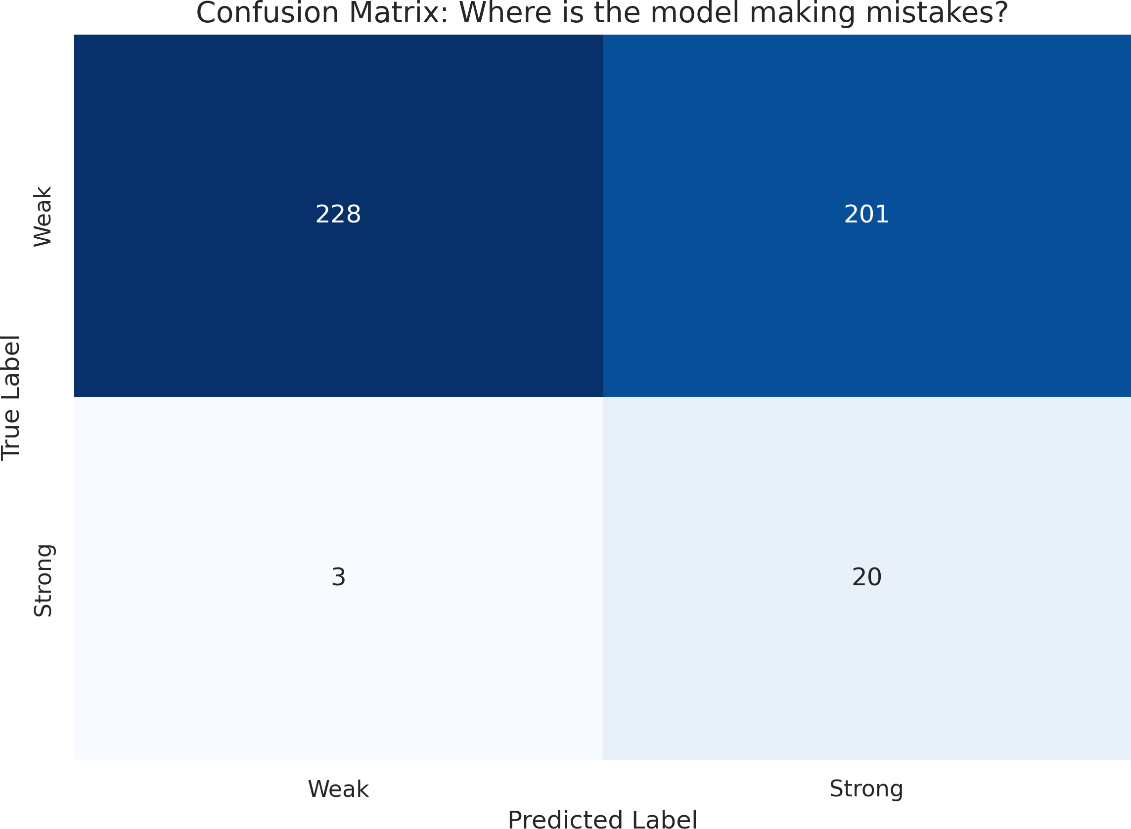
Figure 1: Confusion matrix showing the classification performance of the sequence model on the held-out set.
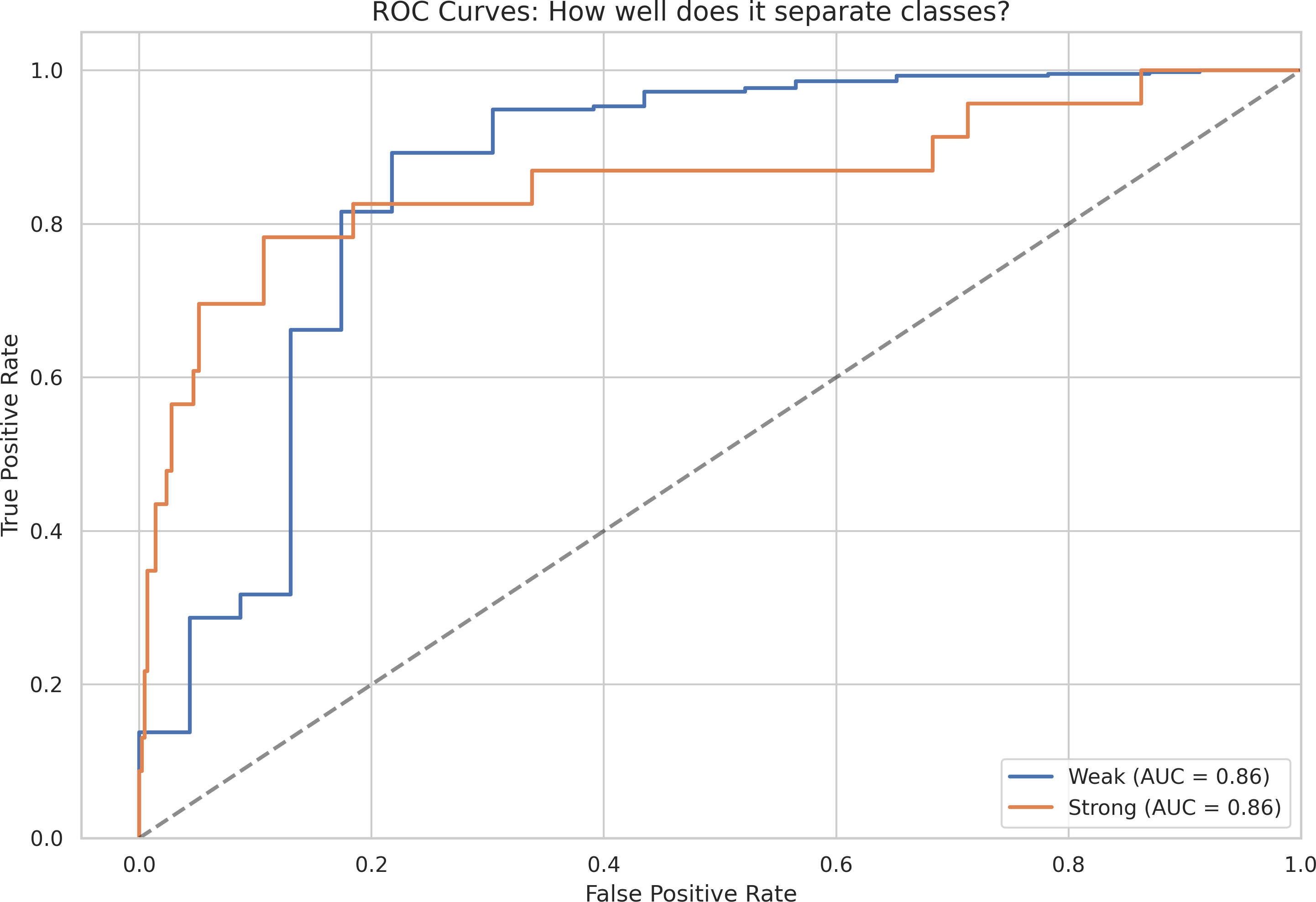
Figure 2: Receiver Operating Characteristic (ROC) curves for each class, illustrating model discrimination ability.
Biological validation
- Prediction vs EC50 correlation
- Prediction vs Δmax or R²
Interpretability
- Saliency maps
- Integrated gradients plots
- Residue importance summaries
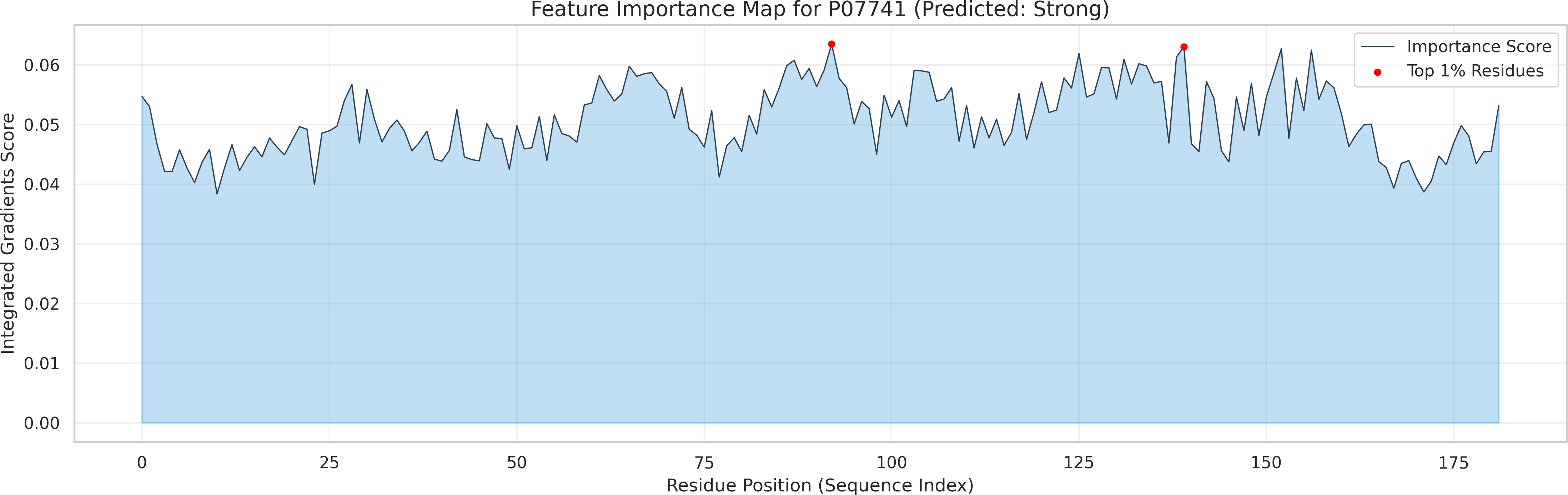
Figure 3: Saliency map highlighting residues whose sequence context most strongly influences NADPH responsiveness predictions.
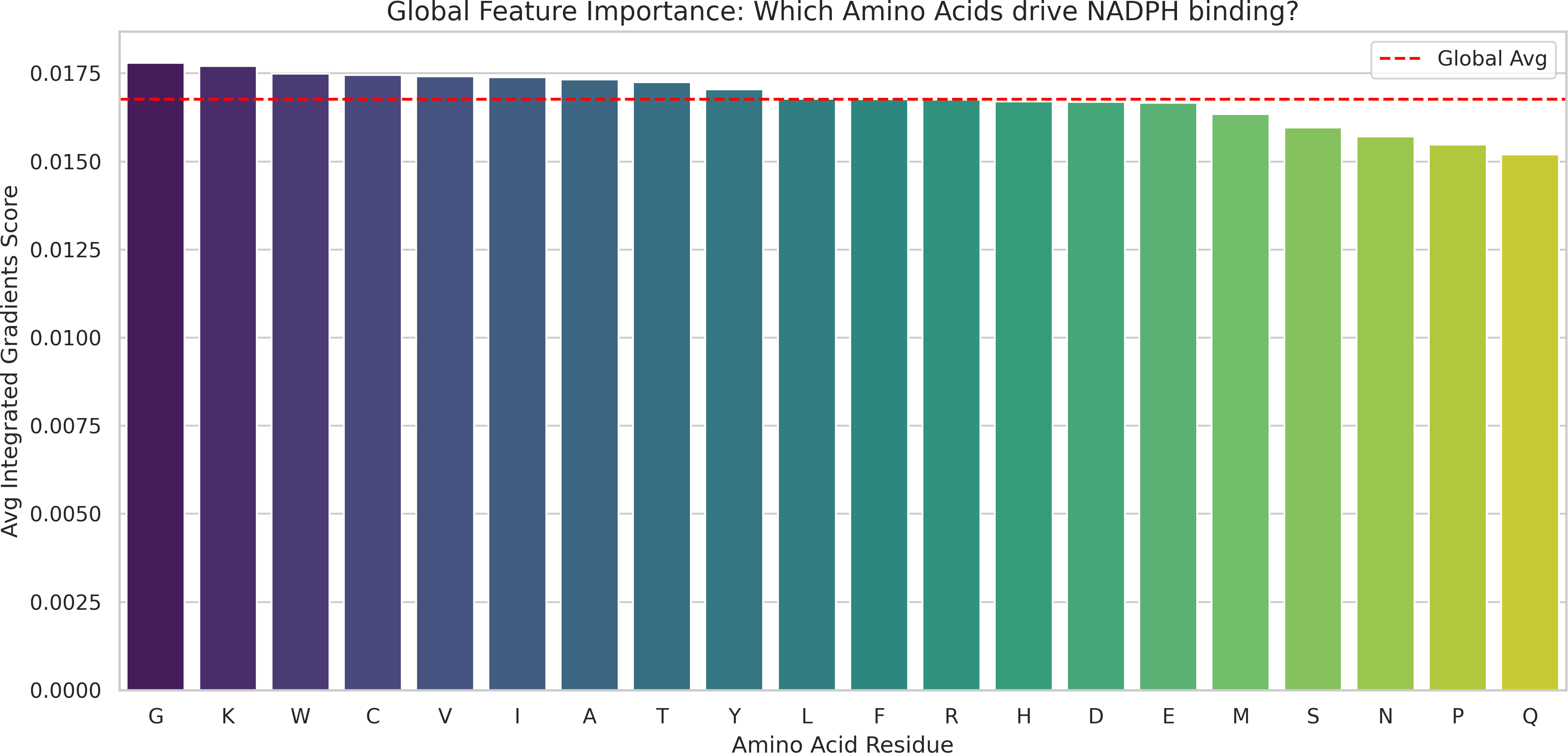
Figure 4: Per-residue importance scores aggregated across the test set, enabling identification of conserved functional motifs.
Error analysis
- High-confidence misclassifications
- Identification of difficult cases
Interpretation
These plots are designed to answer:
- Is the model accurate?
- Does it align with biology?
- Where does it fail?
Visualization is not decorative; it is diagnostic and interpretive.