Research funding is usually presented as a collection of projects: investigator, institution, funding programme, start date, end date.
But research itself does not operate as a collection of isolated projects.
Researchers collaborate. Institutions form recurring partnerships. Scientists move between funding schemes. Publications connect investigators who may sit in different organisations or funding cohorts. Over time, what looks like a table of grants becomes a network.
I wanted to explore what that network could look like computationally.
The result is Biomedical Research Funding & Collaboration Network Platform, an open-source project for constructing and analysing networks linking researchers, projects, institutions, publications, research topics and funding trajectories, with an initial focus on the Else Kröner-Fresenius-Stiftung (EKFS) and the Deutsche Forschungsgemeinschaft (DFG).
Where the idea came from
The project was partly inspired by JafariLab’s Juselius_secretdoor repository.
I liked the general idea of looking beyond conventional funding tables and asking what can be learned from the structure surrounding funded researchers.
I wanted to take that idea in a somewhat different direction: build a reproducible pipeline around researcher identity resolution, bibliographic information, multiple network representations, temporal analysis and funding trajectories.
The question I started with was:
How can we represent the relationships between funded researchers, their institutions, publications, collaborations, topics and funding histories as a computational network?
From funding records to a graph
Funding records from EKFS and DFG form the starting point. Researchers are normalised and mapped into a canonical identity layer. Bibliographic information can then be associated with those researchers, producing a relational representation containing researchers, projects, institutions and publications.
From that representation I construct several graphs.
The coauthorship graph represents researchers as nodes and shared publications as weighted edges.
The institutional graph aggregates those relationships to investigate collaboration between organisations.
Funding membership provides another annotation layer, making it possible to distinguish researchers associated with EKFS, DFG or both.
Finally, the longitudinal representation makes it possible to investigate sequences such as:
DFG → EKFS
EKFS → DFG
or more complex multi-stage trajectories.
The objective is not merely to produce a network visualisation. The graph should remain connected to the underlying data model and be reproducible from the source tables.
Network science rather than just network drawing
Once the graph exists, several questions become possible.
- Who is highly connected?
- Who maintains particularly strong collaborations?
- Which researchers connect otherwise separated parts of the network?
- Are there identifiable collaboration communities?
- Which institutions repeatedly collaborate?
- Does the structure change over time?
- Do researchers belonging to different funding cohorts occupy different parts of the collaboration network?
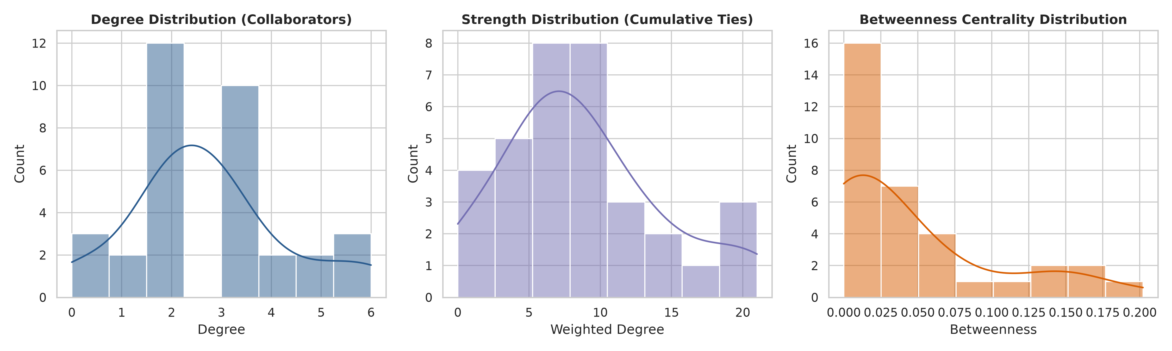
For this I calculate standard network measures including degree, weighted degree, betweenness, closeness and eigenvector centrality, together with connected components and community structure.
The distinction between these metrics matters.
A scientist with many collaborators is not necessarily the scientist who acts as the most important bridge between communities. Likewise, a researcher with relatively few collaborators may connect groups that otherwise have little contact.
That distinction is one of the reasons I find network representations particularly useful for bibliometric data.
Looking at communities
One of my favourite outputs is the network coloured by detected community.
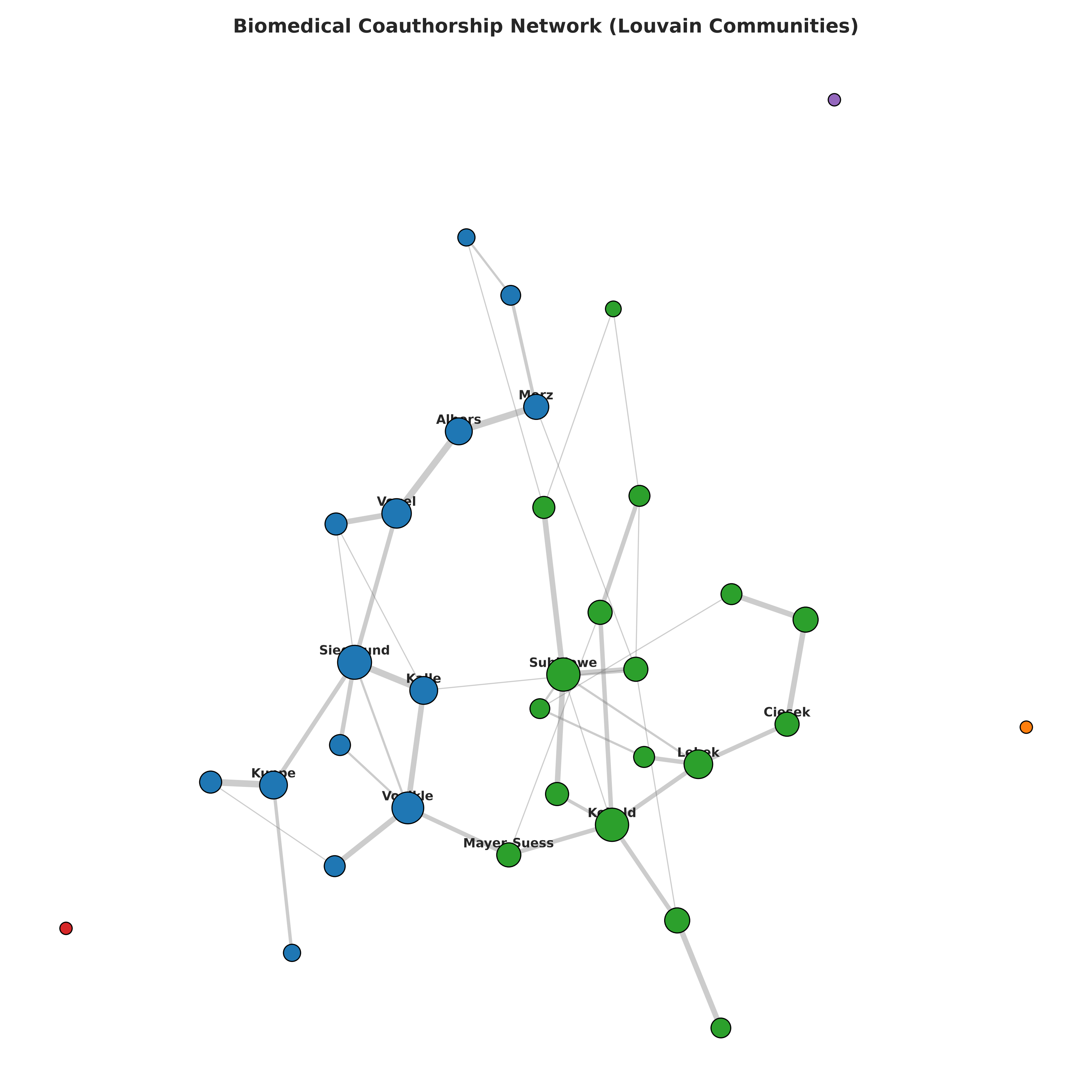
Rather than treating the corpus as a single homogeneous network, community detection exposes regions with denser internal collaboration.
The same graph can then be coloured according to funding membership.
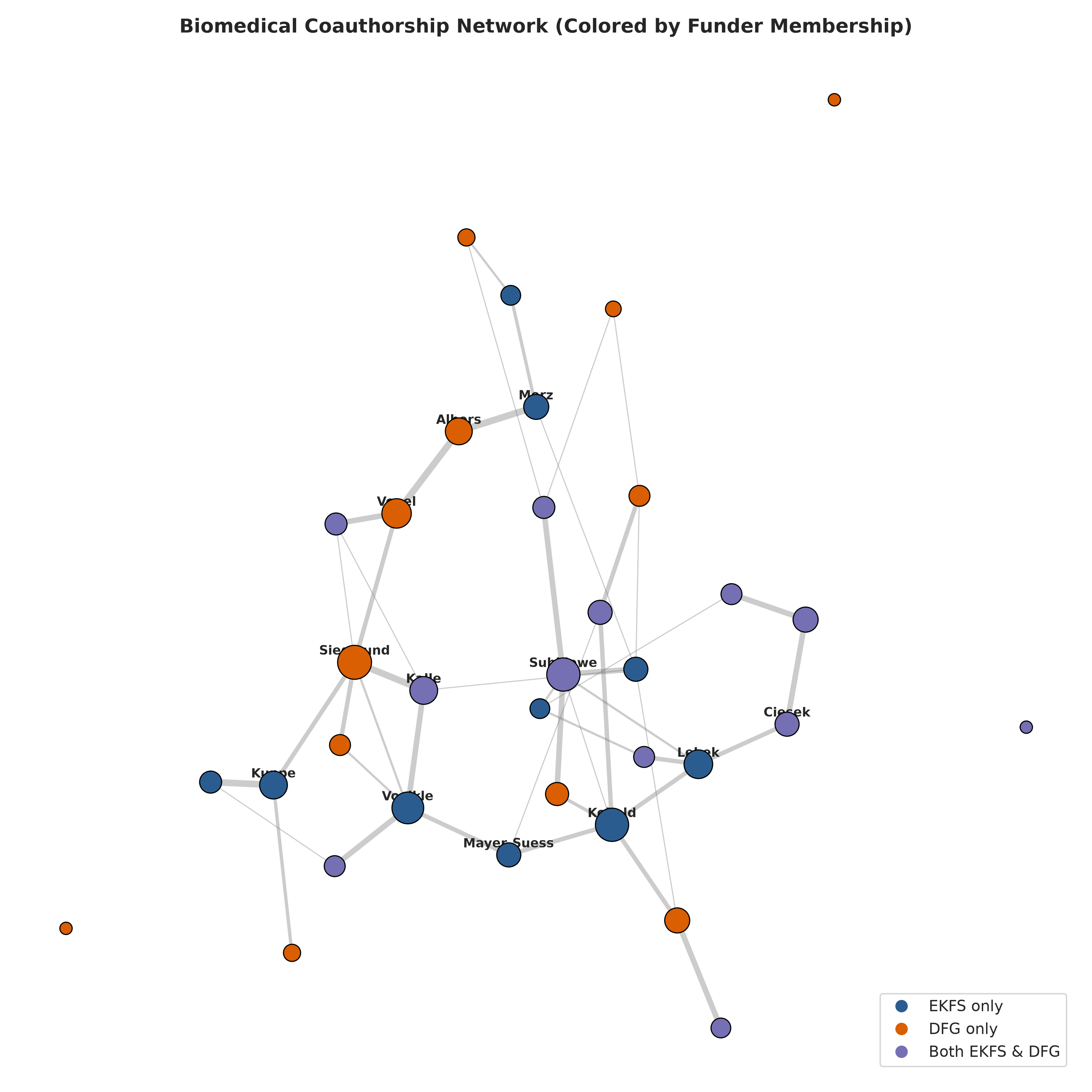
These are two views of exactly the same underlying structure.
One asks:
Where are the collaboration communities?
The other asks:
How are funding cohorts distributed across those communities?
That separation between topology and annotation is important. Funding source should not define the communities in advance; it should be something we compare with the structure that emerges from collaboration data.
Institutions form another network
By aggregating researcher-level collaborations, the pipeline also constructs an institutional collaboration network.
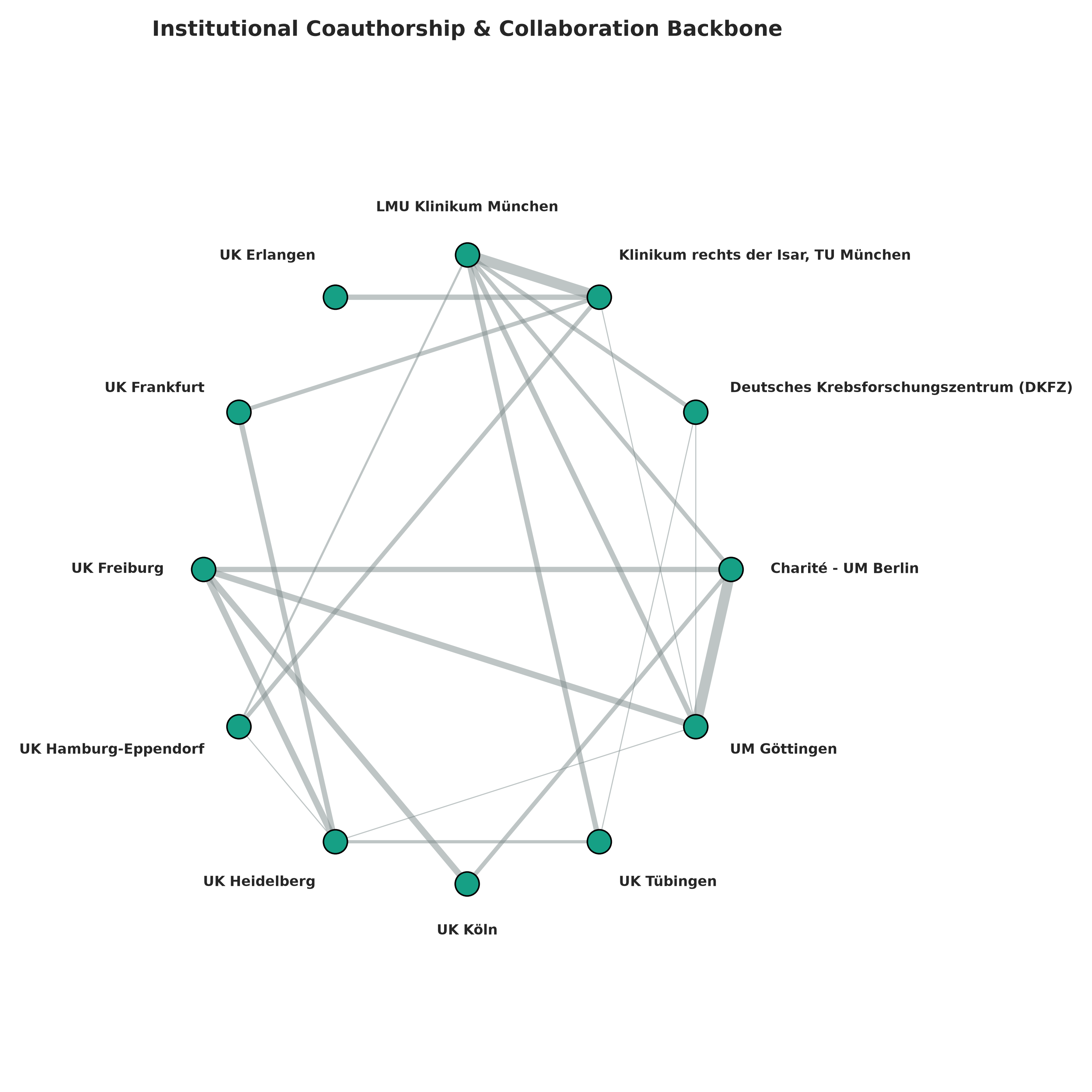
This representation shifts the unit of analysis from individual scientists to organisations.
The same approach could eventually be expanded to cities, regions, countries, research disciplines or combinations of these layers.
At that point, the project starts looking less like a single graph and more like a small network-analysis platform.
Funding as a trajectory
A researcher’s association with a funder is not necessarily static. Funding can appear in different sequences across a scientific career.
I therefore represent observed funding histories as trajectories and visualise transitions using an alluvial representation.
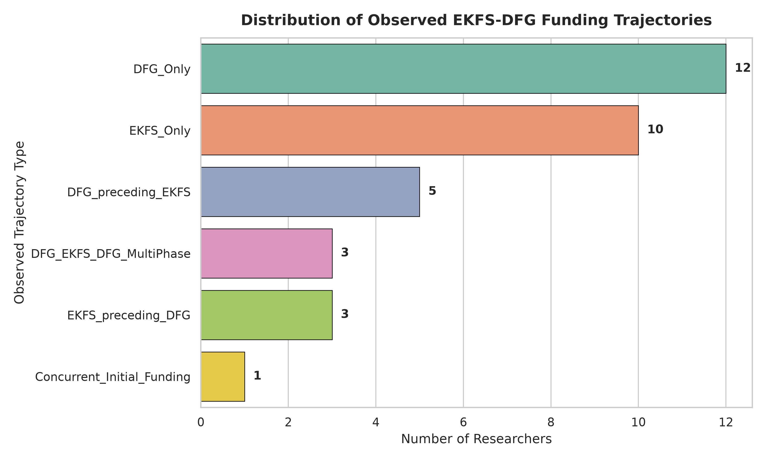
The current demonstration dataset includes researchers belonging only to one funding cohort as well as researchers appearing in both. The important point, however, is the analytical machinery rather than the particular proportions in this prototype dataset.
With validated longitudinal records, this framework could be used to investigate questions such as whether particular funding schemes tend to occur at different career stages, whether researchers transition between programmes, or whether collaboration patterns change alongside those transitions.
Those would remain observational relationships—not causal conclusions.
Networks also evolve
The pipeline can divide publications into temporal windows and reconstruct the collaboration graph for each period.
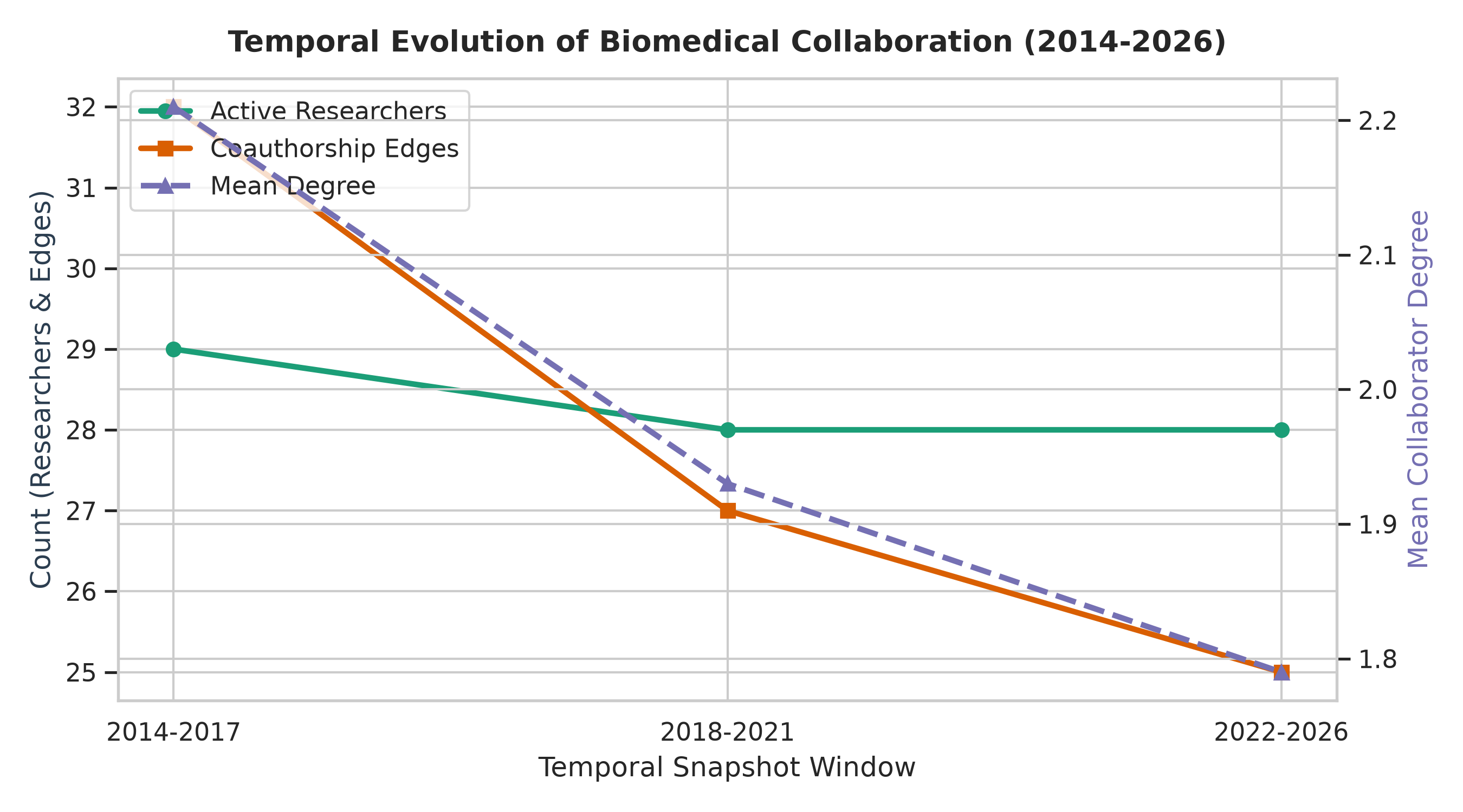
This allows a static network to become a sequence of network states.
Communities can merge or separate.
Bridging researchers can emerge.
Institutional relationships can strengthen or weaken.
Entire parts of a collaboration graph can appear or disappear.
Temporal network analysis is therefore one of the areas I would particularly like to extend.
Taking the graph into Gephi
The pipeline exports network representations that can be loaded into tools such as Gephi and Cytoscape, alongside CSV tables and programmatically generated figures.
I also loaded the collaboration network into Gephi Lite and explored it interactively.
You can zoom from the global structure down to individual nodes, inspect dense neighbourhoods, identify bridges and watch the community structure become visible spatially.
For me, that interaction is one of the most intuitive ways of understanding what a network-analysis pipeline has actually produced.
Reproducibility matters
The repository therefore treats the analysis as a pipeline.
The project includes structured raw and processed data directories, deterministic analysis stages, identity-resolution tables, validation outputs, graph exports, generated figures and tests.
That also makes individual stages inspectable instead of hiding everything inside one large notebook.
An important limitation of the current version
The current public repository should be viewed as a prototype and demonstration of the analytical framework.
At present, the repository contains a generated realistic dataset used to exercise the full pipeline. Some investigator and institution names resemble the intended scientific ecosystem, but project records, identifiers, publications and network relationships generated by this stage should not be interpreted as verified EKFS, DFG or OpenAlex observations.
This distinction matters.
The figures demonstrate what the system can calculate and visualise. They do not yet constitute an empirical study of German biomedical funding.
The next major step is therefore straightforward but substantial, to replace the demonstration snapshots with provenance-preserving records retrieved from the actual EKFS project database, DFG GEPRIS and OpenAlex, followed by explicit identity validation.
Only then would I interpret the resulting network scientifically.
Where I want to take it next
There are several directions I want to explore.
- The first is ingestion of validated real-world records.
- The second is stronger researcher disambiguation using OpenAlex, ORCID, affiliations and explicit audit trails.
- The third is richer temporal analysis rather than treating the collaboration network primarily as a static object.
- The fourth is interactive exploration: filtering the graph by year, institution, funding programme, topic, community or researcher while maintaining direct links back to the underlying evidence.
More generally, I think there is an interesting methodological space between bibliometrics, research-funding data engineering and network science.
A funding database tells us who received a grant.
A publication database tells us what researchers published.
A network representation asks a different question:
How does the scientific system connect?
That is the part I wanted to explore with this project.
Project: https://github.com/bibymaths/ekfs-dfg-biomed-network
Inspiration: https://github.com/jafarilab/Juselius_secretdoor